Thoughts on “Love, Death, & Robots”

Scene from “The Very Pulse of the Machine,” from Volume 3. All images belong to Netflix.

I often come late to TV shows, sometimes years after they ceased to air, so catching up on Love, Death & Robots* on Netflix feels up-to-date. Admittedly, the first volume (why not just say season, Netflix?) was posted in 2019, but a forthcoming fourth season has been announced, so it’s still topical. As an animation buff I was interested to see what they came up with.

Scene from “Fish Night,” from volume 1

The show is a very mixed bag of stylized filmmaking, trite plots, and some gems that make it worth slogging through the chaff. As a rough guide, I found that the more realistic the animation, the less interesting the story, though there are significant exceptions to that. Also, if the characters are in uniform, you can skip the episode completely.

Image from “Jibaro,” volume 3

A more cumbersome, but fitting title for the show might be “Sex, Death, more Death, Still more Death, and Robots.” Love as in the emotion is often replaced with the physical act, and there is way too much bloodletting. Animation can do gore aplenty, and there is a lot if that’s your thing, but it is not a substitute for plot or character development. I was especially disappiointed by the final episode of volume 3, Jibaro, which pairs a lot of death with some truly gorgeous design and animation, which deservedly won 2 Emmy Awards, for character design and Outstanding Short Form Animated Program. The story, a fantastic allegory of colonialism and greed, devolves into a lot of blood in the water, and a soggy denouement that does not satisfy.
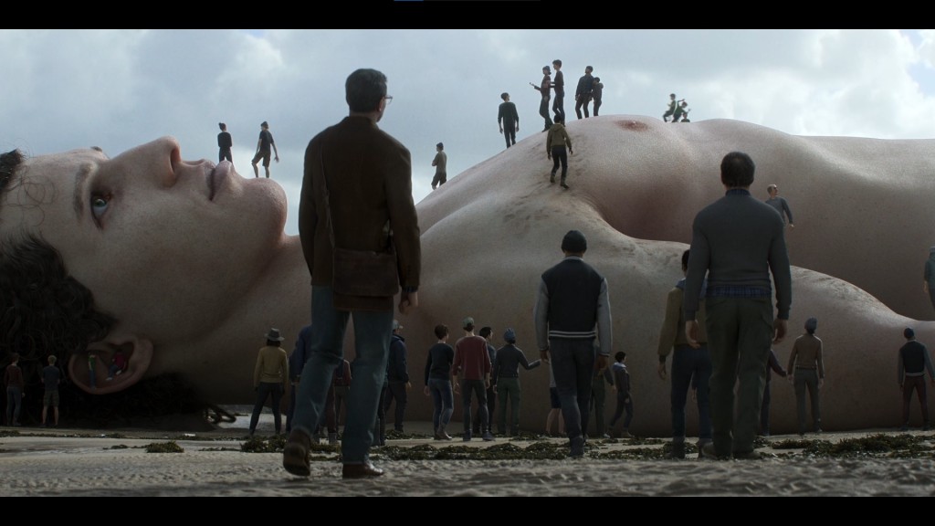
Scene from “The Drowned Giant,” from volume 2

Too often stories fail to resolve satisfactorily, content to subside or fade out when the bleeding stops. Lesser episodes resemble cut scenes from video games, setting the stage for something that never comes. In Vaulted Halls Entombed, from volume 3, is a Lovecraftian story that badly needs another act or two, while another volume 3 story, Night of the Mini Dead, presents a straightforward zombie story in a vaguely satirical way simply by making everything very small – or shot from very far away, it doesn’t matter which.

Scene from “Zima Blue,” from volume 1

Oddly enough, The Drowned Giant, from a J. G. Ballard story, makes its weaknesses into strengths. Illustrating rather than dramatizing Ballard’s story, it contains death without blood, unanswered questions without the frustration, the whole a satisfying meditation on an unusual death. Even its realistic animation helps ground the story. Like the volume 1 story, Zima Blue, The Drowned Giant shows that you can tell stories about death without large amounts of explosions and adolescent posturing.

The title character from “Three Robots,” volume 1

But I don’t want to appear too down on the show. It’s lighter moments shine in particular, with veteran sci-fi writer John Scalzi contributing some of the lightest. He even got to present a sequel, as the robot tourists from an early episode, Three Robots, return at the start of volume 3. Automated Customer Service, which begins volume 2, is another Scalzi work, a light-hearted look at an all-too-credible dystopian future. These episodes were vital in alleviating the heaviness of the ‘let’s kill aliens’ or ‘let’s kill robots’ plots in other episodes.

I’m looking forward to another season – a long one, I hope (the first was 18 episodes, the second 8, and the third 9), and while I might have to wade through more blowing-stuff-up, I’m certain there’ll be a few laughs, and a few thoughtful episodes to make the whole worthwhile. Perhaps I’ll even review it.

*Yes, I am a comma obsessive, so I know the serial comma is omitted between Death & Robots in the title, while I included it in the title to this post.

Three books by Viggo Mortensen

The three books in question. All photos from the Perceval Press website.

Viggo Mortensen will always, for better or worse, be remembered as Aragorn in Peter Jackson‘s Lord of the Rings films, but he also writes, makes visual art, and music – the last of these I might review some later date, when I have heard more. For now, let’s concentrate on some of his books, published through the company he co-owns, Perceval Press, specifically Linger (2005), Miyelo (2020) and Eudaimonia (2021).

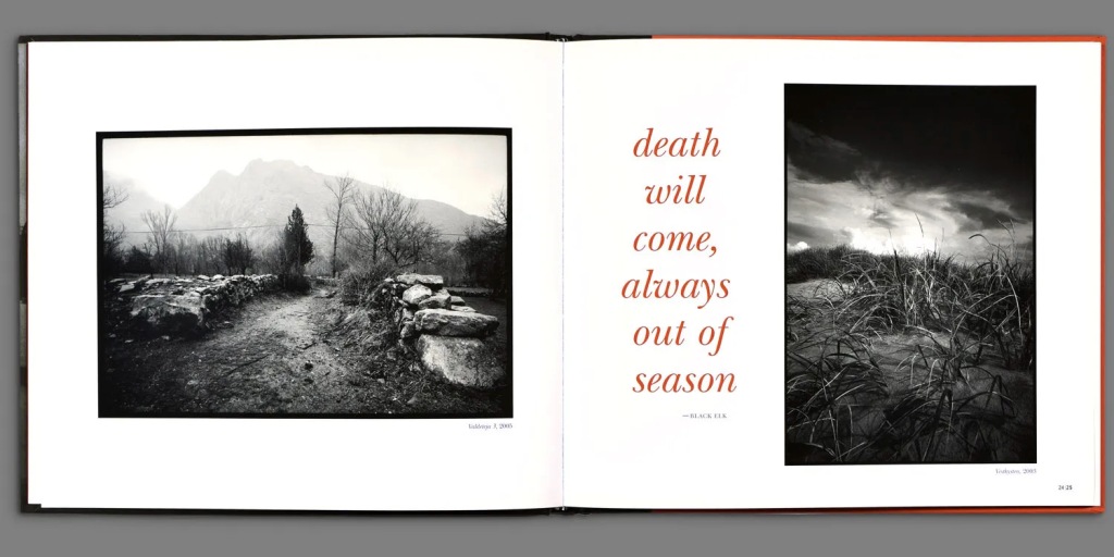
Two pages from Linger

You never quite know what to expect from artist’s books. Some are trifles, little amusements that are quickly forgotten; others are a slice of the artist’s career, suites of works like an exhibit you can keep on your coffee table. Many are nicely presented, glossy and in color, making up for occasional shortages of substance with an abundance of style. All of Mortensen’s books are well designed, and look good on display in the home. You could slip them in among other artist’s books and they’d be right at home.

Linger showcases Mortensen’s photographs and prose writing. As a photographer Mortensen favors the seat of the pants, quick improvised image. When it works, you can feel the place and mood, such as the examples above. When it doesn’t work, the image is a blur, often literally; he likes action photos, and only some of them succeed. Still, that’s par for the course. There are many fine shots in this book, and the text is well written, on the themes of “loss, change, and renewal,” as the website states.

Two pages from Miyelo

Miyelo has the most substance, being a visual account of the Lakota Ghost Dance Mortensen witnessed in March of 2003. The text, by several writers, covers fragments of Native American history and experience. While the nature of the dance doesn’t lend itself to careful composition (Mortensen shot one roll of film on the fly, so many of the photos are blurry by necessity) you feel the rush spectators must have felt as the dance unfolded. The ghostly qualities (are some of these photos double exposed?) and evocative color (the photos in Linger are in black and white) contrast with the plain brown cover, the color of earth or leather.

Eudaimonia is the smallest of the books, and the only one without any photography; I couldn’t even find any interior pages online to show you. It consists of a long poem written by Mortensen during the pandemic, and illustrated (embellished?) with drawings he made while listening to talk radio – which explains the sharp edges and scratchy lines. This is the slightest of the books in terms of content, but I have to wonder how such turbulent times could produce that title: (from the website) “Eudaimonia is an abstract Greek noun comprised of the words “eu” (good, well) and “daimon” (spirit). It is generally taken to refer to well-being or to living well.” There must be a little irony in finding the good in the midst of suffering and turmoil, a little determination as well, and some optimism.

I enjoy artist’s books, and though my budget too rarely stretches to buy them, I’m glad I got these. I like to go to bookstores such as New York City’s Printed Matter, which carries them in considerable numbers, just to browse and see treasures I might never have found otherwise. Now that I know that Mr. Mortensen can write, draw, and take photographs, I’m going to seek out his music, and keep an eye out for whatever else he comes up with. For now, I have some books to read, and re-read, and re-re-read…

Book Review: Three Rocks by Bill Griffith

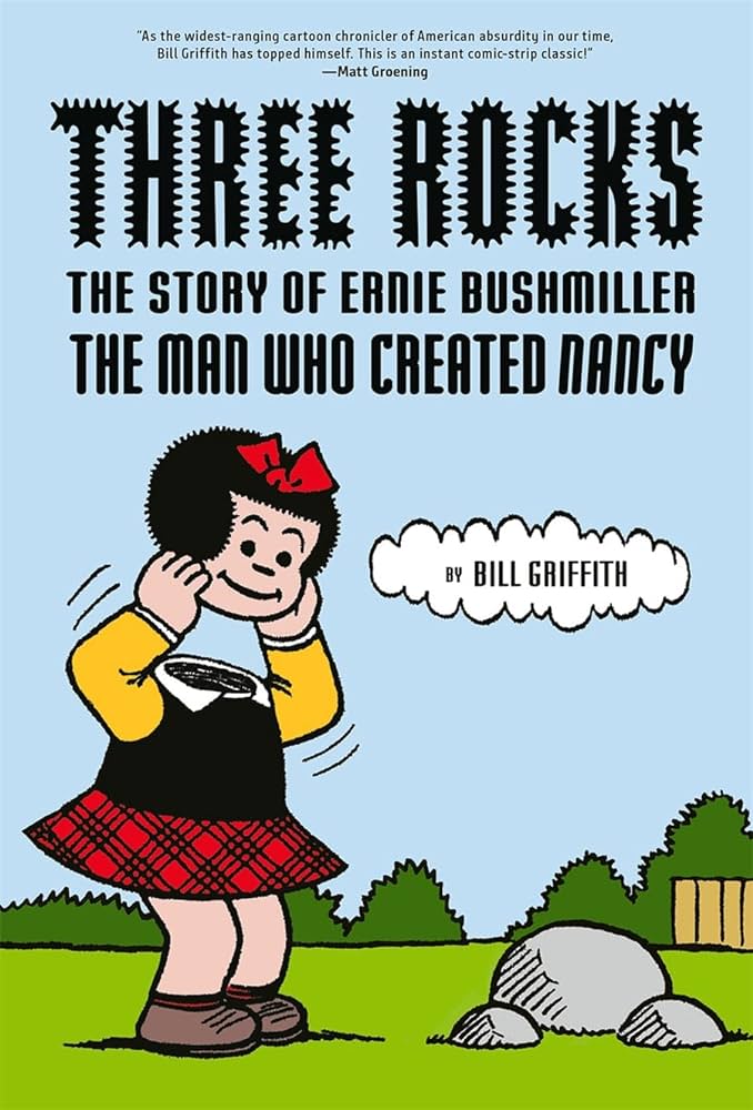
Front cover of the book

The long running and influential comic strip Nancy, drawn for most of its run by Ernie Bushmiller, succeeds because it is not merely about cute kids saying funny things. Like Charles Schulz‘s Peanuts Bushmiller’s kids are more than children, at times self-aware of their existence as ink on paper, other times wiser than their years. Bushmiller went even farther than Schulz at times, keeping one foot in reality and one foot (and often the rest of the body) in fantasy-land.

Bill Griffith, creator of the Zippy the Pinhead comic, and no stranger to surrealism himself, has drawn a fine graphic biography of Bushmiller and Nancy, focussing primarily on Bushmiller’s working life and the richness of his creation. Three Rocks is a summing-up of the complexities disguised as simplicity in Bushmiller’s work, and showcases also Griffith’s fine touch at evoking the cartoonists life and environs.

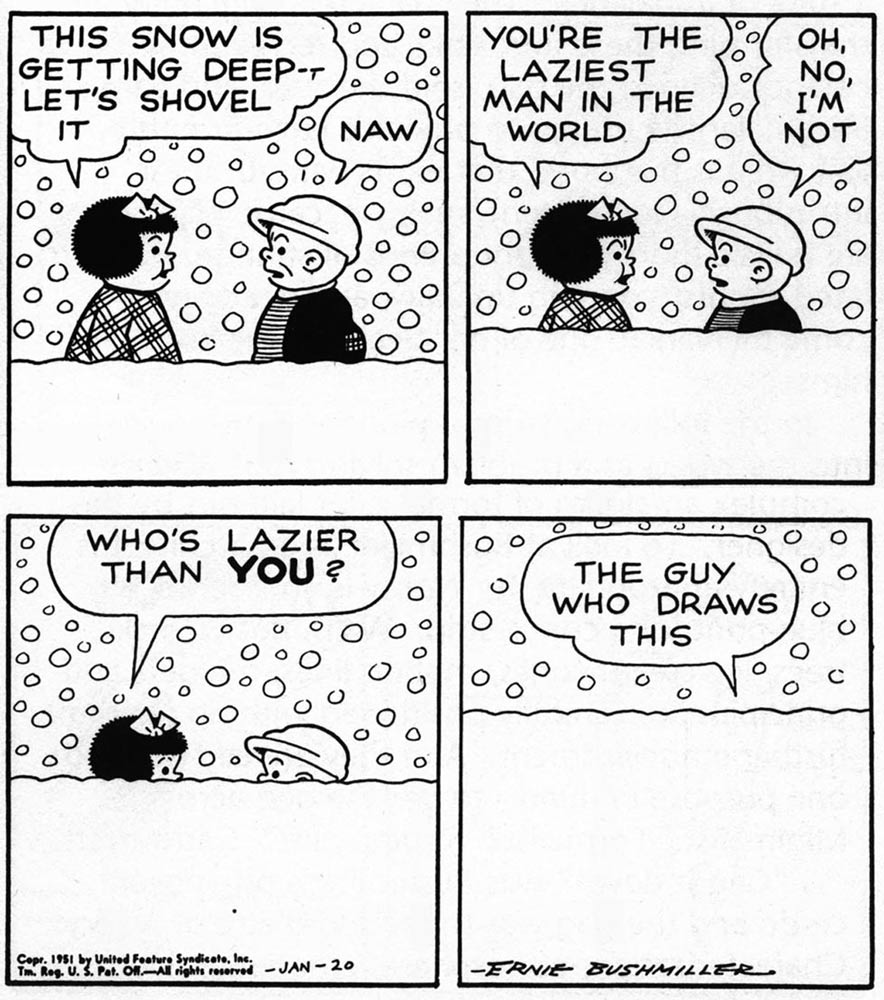
Nancy comic strip by Ernie Bushmiller, 1951

Bushmiller’s life was fairly uneventful, but his creativity took him through decades of adventure, while seemingly confined to the neighborhood Nancy, her sometime boyfriend Sluggo, and her aunt Fritzie Ritz, lived in. Like a vaudeville act the characters are immediately recognizable, but the comics medium allows for visual flights of fancy prohibitive on stage due to logistics or the laws of physics. Bushmiller inherited the strip, then entitled Fritzie Ritz, and took a sharp turn from the daily life of a beautiful young woman by introducing her niece, Nancy, into the work. Nancy slowly took over the strip, leaving Fritzie with a supporting role. He also shed the strip of long storylines, until the one-a-day gag format dominated. Despite these seeming limitations, Busmiller is widely admired, even revered, by fans including artists like Griffith.

Bill Griffith draws Nancy. A page from the book.

Because of the rather ordinary, though successful, arc of Bushmiller’s life, Griffith has room for analysis of humor and style in the strip (the page above being an example of that analysis), and even for a little fun. Included is a set of imaginary letters between Bushmiller and Samuel Beckett, written in 1999 by writer A. S. Hamrah, and first published in Hermenaut magazine that year. It’s fairly funny, and adds a little extra fantasy to a strip that already had quite a bit more than first impressions suggest.

The book ends not merely with Bushmiller’s death, but with a nice, present-day coda of Nancy and Sluggo in retirement, bittersweet and just the right length. A book this richly drawn and thoroughly researched is obviously a labor of love, and this coda confirms it. Griffith has often slipped references, oblique of obvious, to Bushmiller into his Zippy strips, and this book allowed him to pay homage in book form. It’s good to look at, good to read, and worth re-reading.

Nancy by Olivia Jaimes, 2019

After Ernie Bushmiller’s death in 1982, Nancy was continued by others, primarily Guy Gilchrist, who emulated Bushmiller’s style. In 2018 the strip was given to pseudonymous artist Olivia Jaimes, who re-imagined the strip in her own style and sensibilities. Personally, I like Jaimes’s Nancy. It isn’t exactly Bushmiller, but copying stifles creativity. Like Hamlet or any other great character, Nancy should be open to re-imagining. I was glad no one tried to continue Peanuts after Charles Schulz died, but if someone had, I would want them to put their own stamp on the characters. Nancy is still Nancy, and Jaimes has carried on while adding her own viewpoint to Nancy’s world. Some strips are too challenging to outlive their creator – I think George Herrimann’s Krazy Kat is one – while others, like Nancy, should continue.

I can’t help but notice the examples I have included here lean more toward the surreal elements, which is only to be expected. I enjoyed Nancy back in the day, but now I appreciate it even more. Three Rocks is well worth seeking out.

King Robert’s Court, part 2

Many musicians play in a band, and most of them count that as their most important work, even if they are a supporting player – not everyone can or should be the frontman. But Robert Fripp, the one continual member of King Crimson, supporting player with the likes of Peter Gabriel and David Bowie, producer and solo artist, might disagree: he has called his work teaching musicians his “proper work in life.” His teaching, begun under the name Guitar Craft, then retooled as The Guitar Circle, has proven inspirational to many of his students. A companion book, shown above, gives glimpses into the function and reasoning behind The Guitar Circle. Here follows my reactions to reading all 563 pages.

Love cannot bear that even one soul be denied its place in Paradise.*”

The closest thing to a summary of Fripp’s beliefs might be the aphorisms that are central to the Circle’s philosophy, which are assembled alphabetically in the last 30 or so pages of the book. This book is a history of The Guitar Circle told from the inside, as it was told to insiders. Do not expect explication for the layman. References to the Alexander Technique, for example, go unexplained, as it was a part of the Circle’s studies. The Technique is a way of limiting stress on the body, to prevent stress carrying over into other parts and interfering with performance, whether musical or otherwise; to learn more about the technique, try here. The book is taken up primarily with communications from Robert Fripp to students in the Circle, answering their questions or working to better define the philosophy of the Circle itself.

This is not a book about how to play guitar, although there is a very small amount of advice regarding hand positions and the like. It is about the physical efforts required to play, and the philosophical elements that will bring the average guitar picker and make an actual musician out of them. The latter is particularly important, as it allows a glimpse into Fripp’s understanding of what it is to be a musician.

Another aphorism: “Music us a language through which we express our struggle to be human.”

I love these aphorisms, as they show a hippie-esque side of Fripp that is rarely of ever covered by the standard cant about him. (If you’d like to read them without buying the book, they are here. Also, you can buy decks of cards with aphorisms on them.) There is also an unexpected spirituality; God if often referenced, usually with the addition “whatever your understanding of God is.”

The hippie aura is not always present, though. Fripp is undeniably opposed to drugs and alcohol which, considering the number of musicians who have died or been badly impaired by addiction and misuse, is not surprising. Neither does Fripp subscribe to the “do your own thing” attitude, especially when it comes to taking photographs at concerts; this enrages him, as it seems a violation of the relationship between performer and audience, both of whom are essential to the musical experience. “Music changes when people hear it.

Fripp’s anger and frustration with the music industry, which, like most businesses, is about money rather than art, is palpable but not central. His occasional frustration with drummers comes through now and then.

The concern of the musician is music.
The concern of the professional musician is business
.”

In a way, this is a fine counterpart to the documentary, In the Court of the Crimson King, which I reviewed in my previous post. The movie deals with the dysfunction without exploring the magic of KC’s music; the book explores the means Fripp is using to try and reach his goals, still without as much clarity as I would like (again, this it not a primer), but a lot more than the film offers. Fripp’s personality is ever-present, but in a more beneficent context.

I cannot take issue with any of his advice. He recommends daily meditation – he called it “the morning sitting” – exercises to keep the body fit to work at its best through a concert, and much about the mindset of working in an ensemble, communicating with other musicians toward the goal of making something new appear. It’s an admirable goal, and I am enjoying in particular King Crimson’s improvisations, when the band makes a piece collaboratively. Although, according to Fripp, King Crimson ceased to be a few years ago, I’m not convinced: so long as Robert Fripp lives, KC can only be considered dormant. I for one would like him to meet someone and be inspired by bring the King back to life.

I leave you with one more aphorism, relevant to our times: “Life is often desperate, but never hopeless.”

To learn more about Guitar Craft and The Guitar Circle, click here.

*This aphorism not only holds an important place among the Circle’s beliefs, it also forms the title to one of Fripp’s soundscapes, and a beautiful album of soundscapes, available here.

King Robert’s Court (pt. 1)

poster for the film

Legends often have some element of fact, whether deliberately altered to support some agenda, or simply evolved through the twin forces of time and imagination. The myths surrounding the band King Crimson are few but potent. Foremost among these tall-ish tales are those surrounding Robert Fripp, the only member of every Crimson lineup, and de facto King of the group, despite his assertions to the contrary. Fripp is said to be a mercurial figure, a Lear-like madman whose vision of a perfect ensemble is constantly frustrated by the mortals surrounding him (I can imagine Fripp reading that hash of a sentence and frowning, or worse). In the Court of the Crimson King (the documentary film, not the very first Crimson album) reinforces those legends, with Fripp frequently challenging the questions and observations of filmmaker Toby Amies. Thing is, this legend has been repeated so many times that, regardless of how true or not true it is, it has little of value for someone seeking to understand the band or its music. Many bands have internal strife; Fleetwood Mac built a career on it. King Crimson has succeeded despite Fripp’s prickly personality, and likely in part because of it. So what?

A large part of the problem with the film is that Amies seems more interested in the band’s turmoil than the music that came out of it. This is a group that has regularly challenged the limits of rock music and made its own territory within the limits of progressive rock. Worse, Amies has come along ostensibly to celebrate half a century of the band (not exactly counting various periods when the band was inactive) just at a time (in my opinion) when the band is going through one of the least interesting stretches in its history. Is it, perhaps, that the current lineup functions better than previous, or that, like some other bands, inspiration has begun to run thin? It’s no good looking to the music itself; for long stretches of its history, King Crimson employed lyricists to write the words, removing the confessional element that creeps into other band’s works; King Crimson songs are not parsed the way a singer-songwriter like Bob Dylan’s are.

We hear from former band members about their frustration with Fripp, but damn little about what drew them to work with him in the first place – yet no one says “I wish I had never joined.” There is magic of a sort (or various sorts) that goes unexamined. I have listened to every King Crimson studio album*, and at least half of the recent spate of archival live sets, and find a band frequently inspired, always dedicated to the intricacies of their music, and at times uplifting and beautiful. To boil that down to “Fripp is difficult” is an insult to the group as a whole, however true or untrue it is about Robert Fripp himself. Fripp’s own frustration with the band, even in this relatively peaceful configuration, is not well expressed. Fripp has a vision, multiple visions most likely, of what music can and should be, and King Crimson music in particular, but the film captures none of that. Even the scenes of the band at work are fragmentary and unrevealing, perhaps because one of Fripp’s peeves (an understatement) is being photographed while performing. So we get isolated, at time context-free soundbites, fragments that leave us both wanting more and wondering if there is more. It’s like peeking through a window at Camelot, in a thunderstorm, hoping the next flash of lightning will give us a glimpse of the King and his court, or perhaps a cobweb-laden, abandoned ruin.

The film’s most moving element involves musician Bill Rieflin, who was suffering from stage four colon cancer as the film was being shot, and who died in 2020. His commitment to music, even as his life ebbed away, brings the greatest emotional depth to the film, and in this one element, Toby Amies told the story well.

The film, as you can see from the poster above, has garnered multiple film festival showings and poster-worth quotes, but I’m damned if I can tell why. In my next post, I’ll deal with a slightly better peek into the creative process, King Crimson-adjacent, but with Robert Fripp at the very center.

  • For context, my favorite King Crimson albums are far from unusual: their first, also entitled In The Court of the Crimson King (1968), Red (1974), their most hard rock album, and Beat (1982), the second album of their New Wave phase; I admit that the first album of that era, Discipline (1981) is a better record, but I prefer Beat. Likes aren’t required to be logical.

This might be an obituary [updated]

The 1940s saw the full flowering of the golden age of science fiction magazines. You could read the most juvenile, bug-eyed-monster-laden pulp fiction around, or intelligent, adult SF that still holds up today. At the very end of the 1940s, The Magazine of Fantasy, soon retitled The Magazine of Fantasy and Science Fiction, premiered. It was smaller than the pulp magazines, following the trend of reduced page size following wartime paper restrictions, and was without interior illustrations. This year’s first issue of F&SF, the Jan/Feb issue, has failed to appear, and rumors are circulating that the magazine has ceased publication. This, then, is what I hope will be a premature obituary for one of the best magazines of its type.

The beautiful work above, by Hannes Bok, graced the cover of the November, 1963 issue of F&SF – the month in which I was born. It illustrates “A Rose for Ecclesiastes” by Roger Zelazny, a fine story that was nominated for a Hugo award and has been anthologized several times since. The work was reversed for the magazine’s cover (or this image is reversed), and wraps around both the front and back covers of the issue.

Cover to the March, 1953 issue, by Chesley Bonestell

For a blog devoted largely to visual arts, F&SF’s lack of interior art is a drawback, but there were distinctive visuals nonetheless. Aside from the Bok shown above, the magazine featured fine astronomical art by Chesley Bonestell, who set the standard for paintings of other worlds – there is even an award named for him.

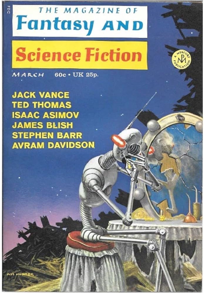
The March 1971 issue; cover by Mel Hunter.

Mel Hunter‘s sad robot paintings, of a mechanical man mimicking people in a post-apocalyptic or alien setting, ran occasionally on the magazine’s cover for years.

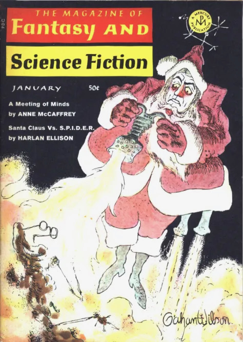
Cover to the January, 1969 issue, by Gahan Wilson.

Gahan Wilson also brought his distinctive style to F&SF, contributing cartoons for years, the only regular art inside the magazine. Above, a Wilson cover; below, one of his cartoons.

F&SF July, 1968. Art by Gahan Wilson

Magazine publishing has been in decline for decades, and not even a resurgence of pulp fiction has reversed that trend, though it has slowed. Originally a monthly publication, F&SF went bimonthly in 2011. It remained one of the premier venues for writers, and its loss will be keenly felt. There is still time for some idealistic publisher (with deep pockets, I hope) to revive the title, but for for now mourning is the order for the day. Below is the most recent issue, dated Nov/Dec. 2023:

Update: the Winter 2024 issue has been announced – a sudden, unannounced change to quarterly publication. The cover is below:

Grayscale, a screed

Still from Metropolis, 1927

With apologies to Malvina Reynolds, and her song “Little Boxes:”

“There’s a gray one and a gray one
And a gray one and a gray one
And they all look just the same…”

For much of my life I dressed like everyone else. Fashion was alien (Wasn’t that something only women did?) or just uninteresting (Oh, sure, yet another three-piece suit…). Whatever “finding myself” means, one aspect was that I began taking an interest in how I look. Oh, color was important; even back in high school my paintings were brighter than anyone else’s, and I noticed when a house or a room was brightly painted, but it never applied to me until I was…well, let’s say “early middle aged.”

The back of my head.

This newly expanded fascination with color roughly coincided with the emergence of gray as a fashionable color. Suddenly, it was everywhere: on houses, stores, from gentle silver to near-black darkness. Last year I had jury duty, and afterward (I didn’t get to serve; the lawyers took one look at me and settled out of court) I went across the street to a breakfast-and-lunch place for a bite. The decor was gray on gray on even darker gray. I thought, “Sure, the courthouse is right over there, but did you have to make this look like a prison?”

The gray tee shirt is omnipresent, in that it rarely looks perfectly clean, and so hides any actual dirt that might be present. The “I slept in these clothes, possibly in a gutter” look abounds. Everyone looks like everyone else, and rarely does anyone look good – see the workers trudging in lockstep in Fritz Lang’s Metropolis, at top.

The Herbert F. Johnson Art Museum, Cornell University, Ithaca NY

Now, gray has its place, and some people can pull it off, but repetition breeds contempt, and I for one want more color in this drab world. Gray is the color of concrete, the most unforgiving of industrial materials, and particularly beloved on Brutalist architects. The Johnson Museum, above, is a pretty good Brutalist structure, albeit a bit small for an Ivy League university art museum. However, nobody has to live in it.

But people do live with concrete, as concrete floors have become common in current home designs. Yes, it is possible to paint concrete, cover it with rugs, or even mix pigment into the concrete itself, but aside from the grayness of the material itself, there is its unforgiving nature as a floor. Concrete is a pain to repair; it is also very hard on your feet, as any dancer will attest – and who wants a home that’s uncomfortable to dance in?

The search for ecologically friendly materials is a worthy one, so I understand the turning away from wood flooring, but a replacement that is worse in so many ways is no improvement. Unless the house you are building (even if only in your head) is a Brutalist one, stay away from concrete. Similarly, if you have more than two gray tee shirts, consider giving one away – unless you’re one of the few who can pull off gray. In that case, count your blessings.

This is not an obituary

Carl Andre, Intimate, 1961

Minimalist sculptor Carl Andre has died, at 88 years old. He was an important figure in Minimal art, that cut-de-sac of simplicity part of Minimalism, which encompasses music, architecture, even an approach to living, but Andre is just as well-known for the dark side of his life as his artworks. You might call him the Henry Kissinger of art, admired and reviled by turns. (Yes, this is an imperfect comparison; all comparisons are imperfect.)

Andre’s works have a tightness, a rigidity stemming from the use of industrial materials, be it wooden railroad ties, square metal panels, or, as in the “concrete poem” above, the typewriter. If you want more emotional impact in your sculpture, try Richard Serra, whose pieces are Minimal turned maximal. The simplicity of Andre’s works – a rectangle of stacked bricks, a square made up of metal tiles laid on the floor – allows the texture of the materials to shine through, an effect doubled by the often austere, minimal white box of the archetypal modern art galley. More than any other visual artist, Andre stands as the poster boy for Minimalism.

Carl Andre, 36 Copper Square, 1968

In September, 1985, artist Ana Mendieta, who married Andre 8 months before, fell from a window of their New York City apartment and died. Andre was arrested and tried. He admitted that they had been drinking and fighting, but asserted that he was not in the room when she fell. His trial ended in acquittal due to a lack of evidence. Her death remains controversial, and is a tragedy regardless of the details. She was talented and vibrant, but to fetishize her death and value her as a victim more than as an artist would be to double the damage.

The art world will forever remain divided as to Andre’s guilt or innocence. But “innocent until proven guilty” is not just for people we like. There are stories of Andre being a violent drunk, and it may well be that he murdered Mendieta. His position in the canon of art history does not change, despite our wished to enshrine the good and bury the bad. Picasso‘s treatment of women was poor at times, but his place in art is unaffected by that; Caravaggio‘s career was deeply affected after he killed a man in an argument over a game of tennis, but he also remains among the great artists of all time.

A view of Carl Andre’s Stone Field Sculpture, 1977

Years ago, I was writing an essay about Carl Andre’s Stone Field Sculpture, a 1977 work in Hartford, CT, across the street from the Wadsworth Atheneum, not only my hometown museum, but also my employer for a time. I reached out to Carl Andre with a question, and we corresponded briefly. I felt very uncomfortable about this, and ended the correspondence quickly. The article sat on my hard drive for years (did it end up as a blog post? I should check). His hand-written letters are still in my files. Was I writing to a murderer? The only two people who could answer that question are dead, and I am uninterested in those who try to tell me that they know. The world is too full of people who think that their opinions equal Truth.

So here I am, conflicted. Violence against women should not be tolerated, yet I am a firm believer in “innocent until proven guilty.” Despite much nonsense from pundits, there is no “cancel culture” that can erase bad actors from history.

This is not an obituary.

Two Shakespeareans

My birthday and Christmas come roughly within a month of each other, so the end of the year finds me blessed with new books, music, etc., to offset the bleak midwinter. 2023 was good to me in that regard, and especially when it comes to English Shakespearean actors.

First, as you can see, is Sir Patrick Stewart‘s memoir, Making It So. I remember Stewart as the scheming Sejanus in I, Claudius, way back in 1976, but, like most TV and movie buffs, didn’t really become a fan until he starred as Captain Picard on Star Trek: the Next Generation, starting in 1987. Much of his career was on stage prior to that, and his life both on and offstage was sufficiently interesting to pack this book full of incidents and characters aplenty. Not merely the famous people (Paul McCartney! Kirk Douglas!) but lesser names whose friendship and collaboration helped make him the star he is today. I would have welcomed an even longer look at some of his friends (not enough Brian Blessed for my taste) but perhaps he is allowing them to write their own stories.

Stewart is a facile and engaging writer; having worked as a newspaper reporter in his youth, he knows how to work a story out without dragging or pointless anecdotes. His life has not always been easy, but he does not shy away from the darker elements, and takes the blame when the blame is his. It is enjoyable to see a talented performer gain fame and recognition without giving in to ego. The book is very readable, and highly recommended.

Dame Judi Dench needs no introduction, even though she has not been granted an iconic role, such as Captain Picard was to Patrick Stewart, but she is well-known for decades of stage and screen work. Shakespeare: the Man who pays the Rent, is not her first book, but is specifically about the roles she has played in Shakespearean theater. It takes the form of transcribed discussions between herself and fellow actor Brendan O’Hea, and so flows naturally through each role, with occasional digressions presented as separate chapters. This format doesn’t allow me to comment on Dench as a writer, and I haven’t read her other books, but I found it addictive, reluctant to put it down before she has finished remembering and analyzing a particular play: her costume, interpreting the character, and incidents from the particular productions she appeared in.

Brendan O’Hea, for his part, is a fine interviewer, keeping himself in the background while asking the right questions to keep the conversation going. As an actor, director, and Associate Artist at Shakespeare’s Globe, he knows whereof he speaks, which helps things along considerably.

I have only one quibble about this book, or about its publication. It was, sensibly enough, published in the UK last year, in time for holiday shopping. In the United States, it will not be published until April, 2024 – why? Is it somehow timed to the anniversaries of Shakespeare’s birth and death, both of which happened in April? (Ah, yes; MacMillan plans to release it on April 23, Shakespeare’s 460th birthday.) Nevertheless, I was happy to get the UK edition at Christmas, and happier still to read it.

One of the joys of this technological age is that we have a chance to see outstanding Shakespearean actors at work, years or even decades after their final performance. I have enjoyed seeing Patrick Stewart and Judi Dench time and time again, and look forward to revisiting both their famous roles and, now, their books.

Merry Christmas and a Happy 2024.

Review: McSweeney’s Horror Stories

I’ve been a fan of McSweeney’s, the high-concept, wildly uneven literary magazine, for years. Though I haven’t followed them closely in recent years – and only subscribed once, ages ago (2010-11), I am always curious to see what each new issue brings. You never know what to expect.

McSweeney’s issue 33, 2010

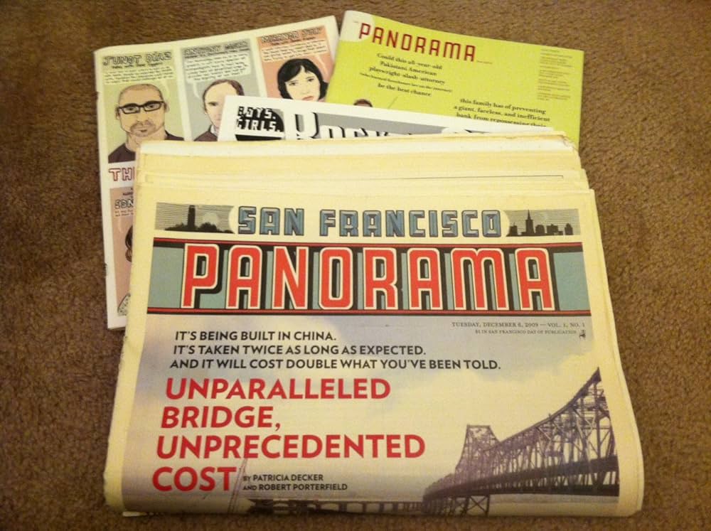
A couple of examples from my days as a subscriber; I saved two issues, and have them to this day, for very different reasons. Issue 33 (2010), is a brilliant one-time Sunday newspaper, The San Francisco Panorama, that is both a tribute to the greatness of Sunday papers, and a poignant reminder of what has been lost. The only weak spot was the comics section which, while enjoyable, had too many strips that left no desire to see more. Still, a collection of new Sunday comics – great to see.

Above, McSweeney’s issue 36 (2011); below, King Crimson’s In the Court of the Crimson King (1968)

By contrast, issue 36 came as a box, containing booklets, pamphlets, postcards, even a roll of fortunes for fortune cookies. The cover art looked…familiar (see above; perhaps Mr. Crimson has been through therapy). The contents were occasionally clever, but not especially good. Even the fortunes seemed half-hearted and lame. McSweeney’s can be very good, or very clever, rarely both at once, but if you don’t read it, you miss the gold among the dross.

McSweeney’s issue 71 (2023)

I decided to buy a copy of issue 71, Horror Stories, as I occasionally read weird fiction, and was curious to see what gems might be found – or how bad it might be. I’m happy to report that the worst story in the issue is good, and many are better than that. Guest editor Brian Evenson, himself an award-winning writer, has assembled a collection of other acclaimed writers, and a few who have yet to win anything, but could well in the future. Even the letter column (this is a magazine, after all) contains weird tales from horror writers.

I approached the issue with trepidation, for the issue itself comes in a slipcase, inside of which is another slipcase, inside of which is a third slipcase, all decorated with art by Jordan Speer. A clever presentation, but I started having flashbacks to issue 36. The issue itself is black, and looks like a Bible or prayer book – surely not by accident. The endpaper illustrations, by Jeffrey Kam, are reminiscent of Surrealist art, and set a nice tone, though neither they nor the slipcase art illustrate any particular story. In fact, one deficit is the lack of illustrations – I am on record saying that all books should be illustrated – though there is decorative lettering for the title page of each story, by Jesse Jacobs.

That’s not quite true: there is one story illustrated, Plague of Frogs by Brandon Hobson, though the art is credited to the narrator of the story. Hobson’s prose is so evocative and dense that the illustrations, while welcome, add little. Still, as mis-steps go, this is a small one. The stories run the gamut from plain-spoken to ornately built worlds (The Sacred Return by Natanya Ann Pulley almost gets away from her, so elaborate is the world-building) to true-crime style horrors.

I won’t go into much detail about the stories themselves, as the best way to approach a horror story is without assumptions, letting it shape itself like a dream in your mind, moment by moment. There are no clunkers. The Noble Rot, by Nick Antosca, was one of my favorites, cinematic in its storytelling – no surprise, as Antosca has written and produced for TV. The Refrigerator Cemetery by Mariana Enriquez, is similarly vivid in its imagery. As I said, there are no clunkers. I put the issue down after finishing the final story (Lover’s Lane by Stephen Graham Jones) with a sigh of relief, and a slight shiver. I hope one day, not too soon, McSweeney’s will delve into horror fiction again. Until then, I’ll revisit their grimoire again. Their next issue promises to be a collection of manifestos, which could be a horror in very different ways.

I’ll leave you with a few random observations and things that stuck in my head – which could be the title of a horror story…

Favorite sentences: “A man who looked like a thunderstorm” from The Noble Rot; “…dread is a fire that starts everywhere at once,” from The Wolves by Senaa Ahmad; “The house was empty even when we were all in it,” from Berceuse by M. T. Anderson.

And I have to ask: did the editors notice that two consecutive stories feature a missing or the loss of a hand? George Lucas would approve.

You can buy the issue from McSweeney’s here.